Challenge
In January 2021, Parks Real Estate merged with two other locally-owned brokerages, Village Real Estate and Pilkerton Realtors. As with any merger, we faced the unique challenge of aligning and unifying three brands while striving to respect the brand loyalty and sensitivities held by agents and staff. An additional challenge of the merger was that our offices were spread throughout the Greater Nashville area, with some operating in the urban core and others in more suburban areas. The diversity in locations created a range of design needs and preferences for each office.
Solution
To unify three brands and support a variety of design needs, we set out to develop a streamlined design system that honored different aesthetic preferences while ensuring overall visual harmony. Our goal was for each design to look distinct, yet consistently reflect the Parks brand DNA. By streamlining the process, we created a comprehensive set of marketing templates—including print and social assets—to provide clear guidance and eliminate guesswork for the graphic design team.​​​​​​​

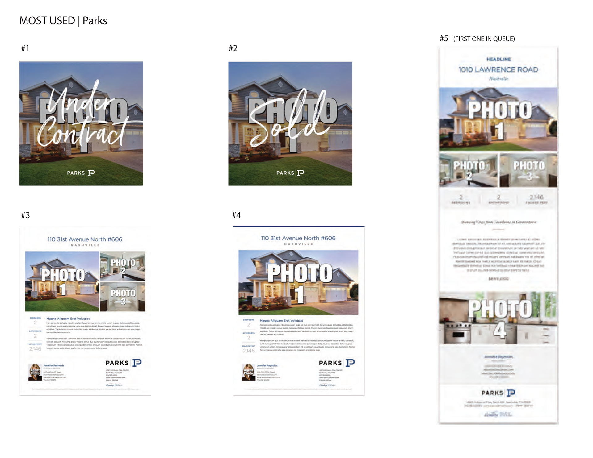
Audit of Parks' most used marketing templates

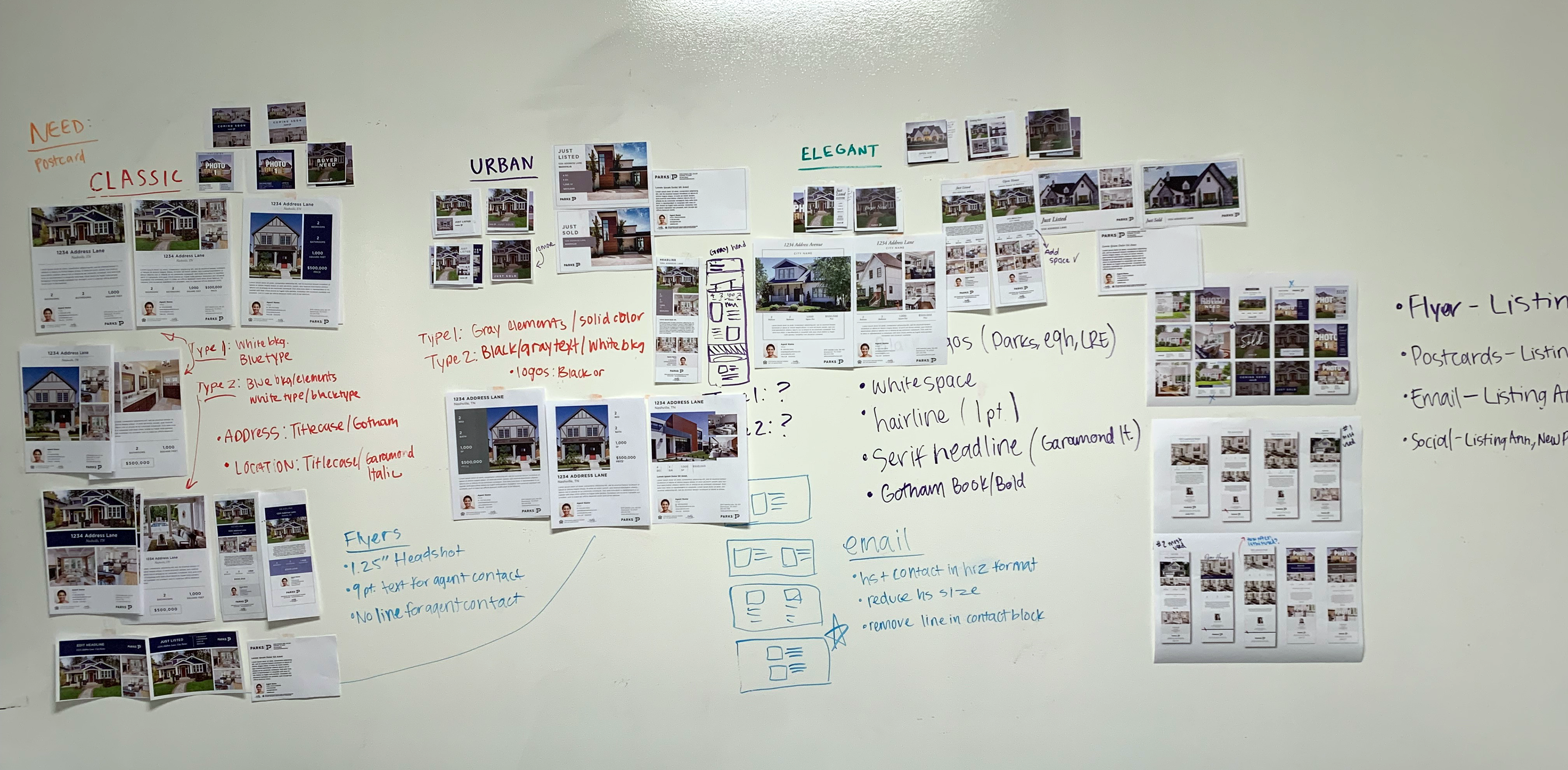
Planning style guide for the three design categories (later renamed)

Project Execution Plan
1. Audit Parks' current design templates to see which were most popular with agents 
2. Audit Village marketing materials
3. Discover similarities and unique design characteristics between the two brand audits
4. Narrow down the various design aesthetics to three main categories: Signature (standard use of brand assets), Polished (refined, editorial-style), and Modern (bold, minimalistic)
5. Create a short-hand "style guide" for each category, noting prominent distinctions like typeface stylings, symmetrical vs asymmetrical grids, and color palettes
6. Design templates for flyers, brochures, mailers, emails, and social graphics for each style category
7. Internally promote the new templates as "Design Collections" to increase agent interest and adoption

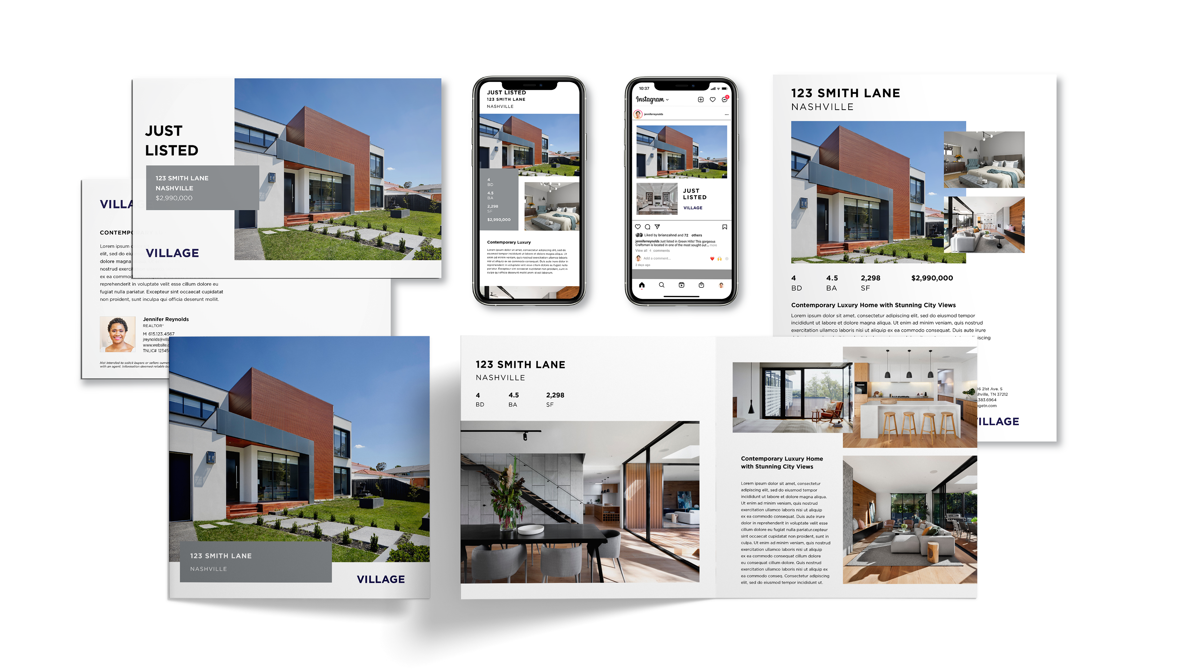
The Modern Collection

Designed with our urban core agents in mind, this collection used our sans-serif typeface, Gotham, our neutral brand palette, white space, and an asymmetrical grid.

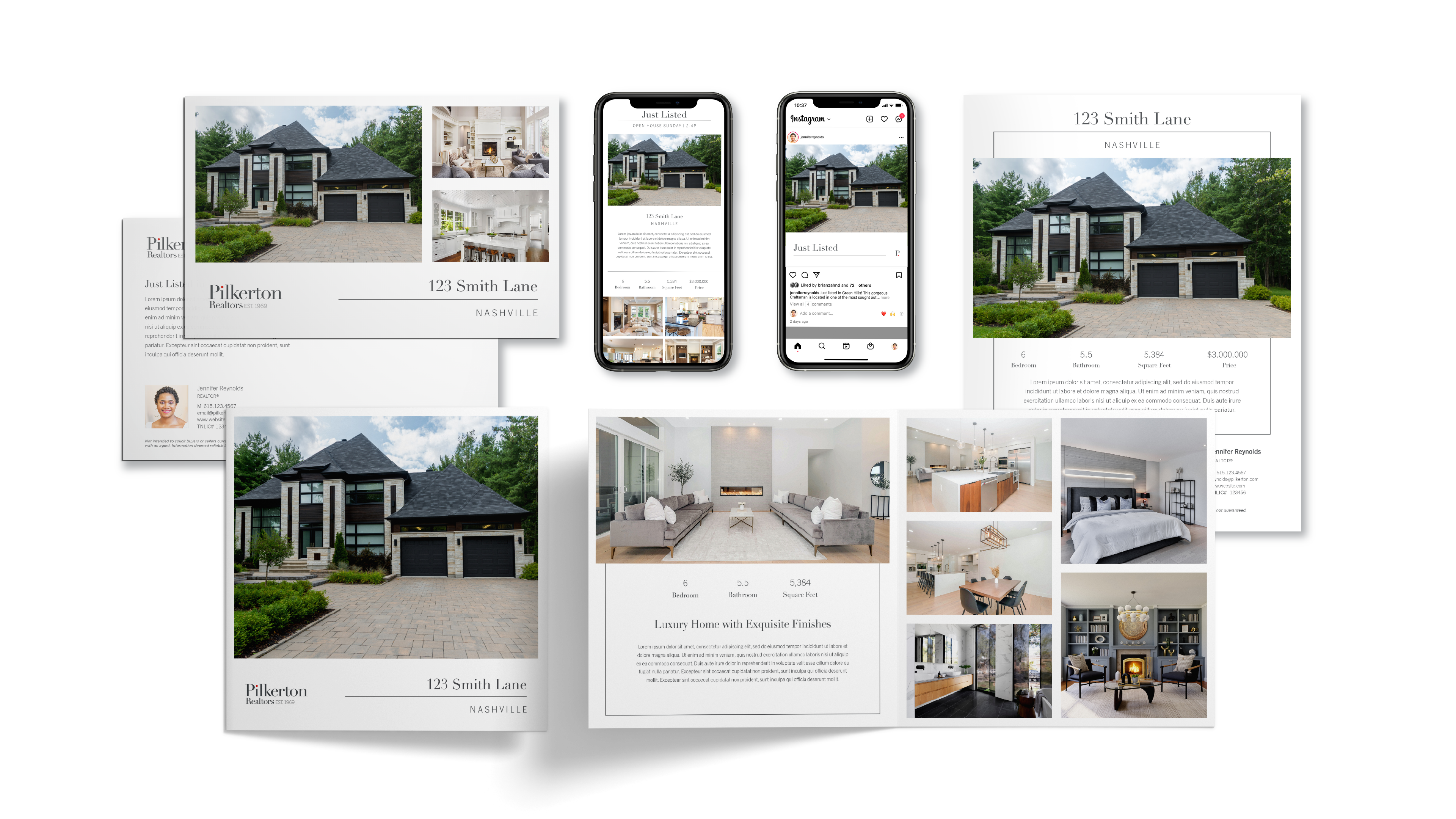
The Polished Collection

Inspired by estate photography and the "quiet luxury" movement, the Polished Collection emphasized photography and used subtle, functional graphic elements such as borders and divider lines.

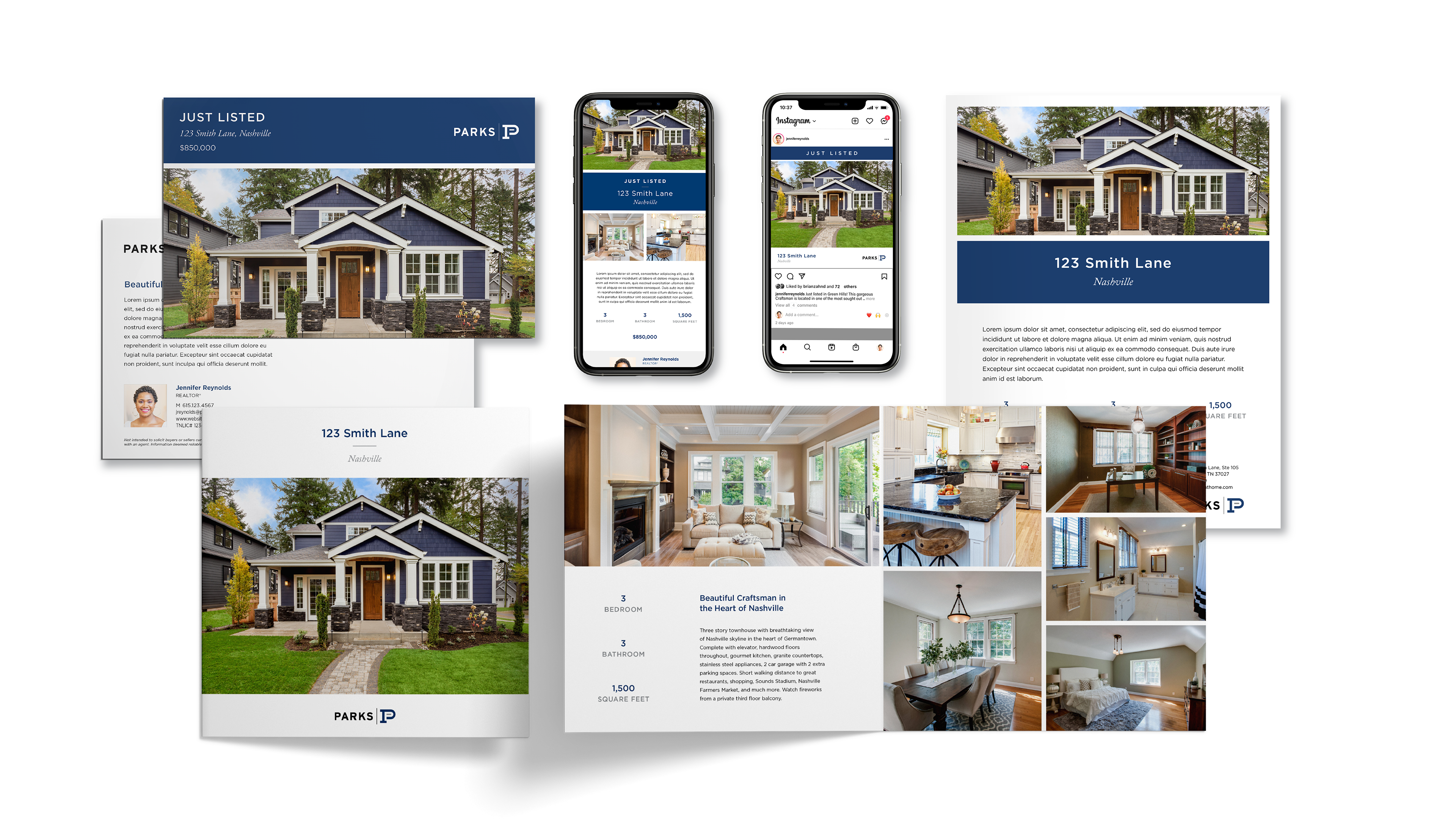
The Signature Collection

To further strengthen cohesion within the Parks brand, we launched the Signature Collection. These templates were intended to be "one-size-fits-all," regardless of the price point of the agents' listings. This collection featured color blocking with Parks' primary palette and prioritized clean, straightforward design and readability.

Outcome
After launching Design Collections, adoption of our template platform grew rapidly. Offering a variety of styles enabled agents to assemble cohesive marketing packages for their listings, replacing the previous piecemeal approach. The expanded template selection also reduced the number of special requests for custom designs because agents found suitable options on the platform. This shift significantly reduced design time for one-off marketing requests and allowed designers to focus on higher-impact projects.​​​​​​​

You may also like

Back to Top