Objective
JustSkin Dermatology was preparing to open an office and needed help with branding and identity work. JustSkin uses a holistic approach to treating skin and wanted to keep the focus on enhancing natural beauty.
Solution
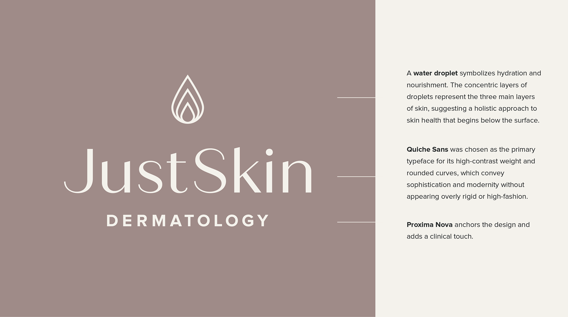
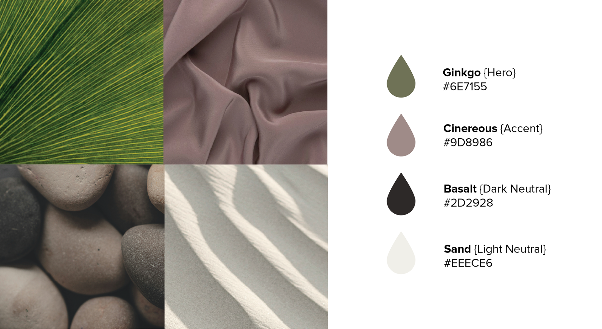
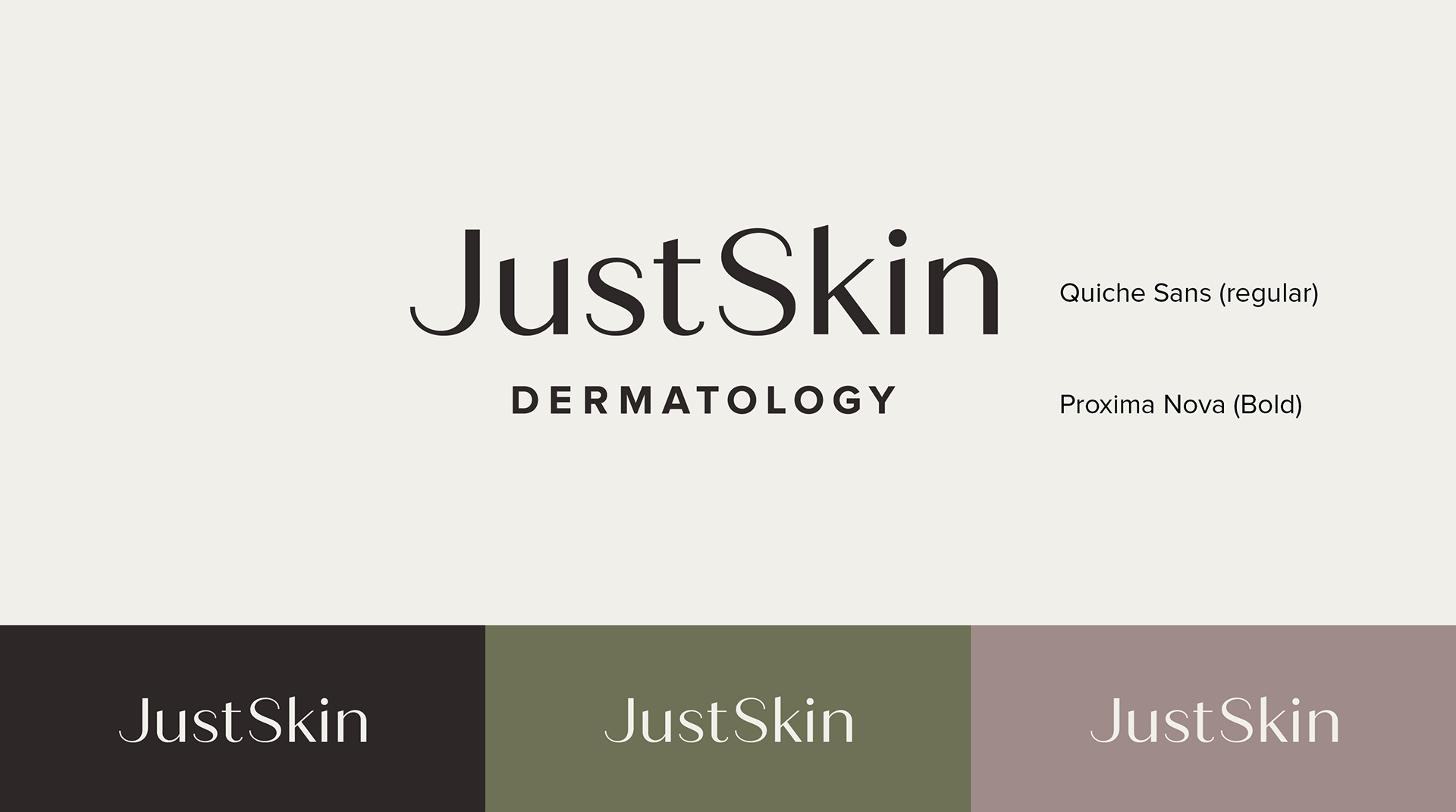
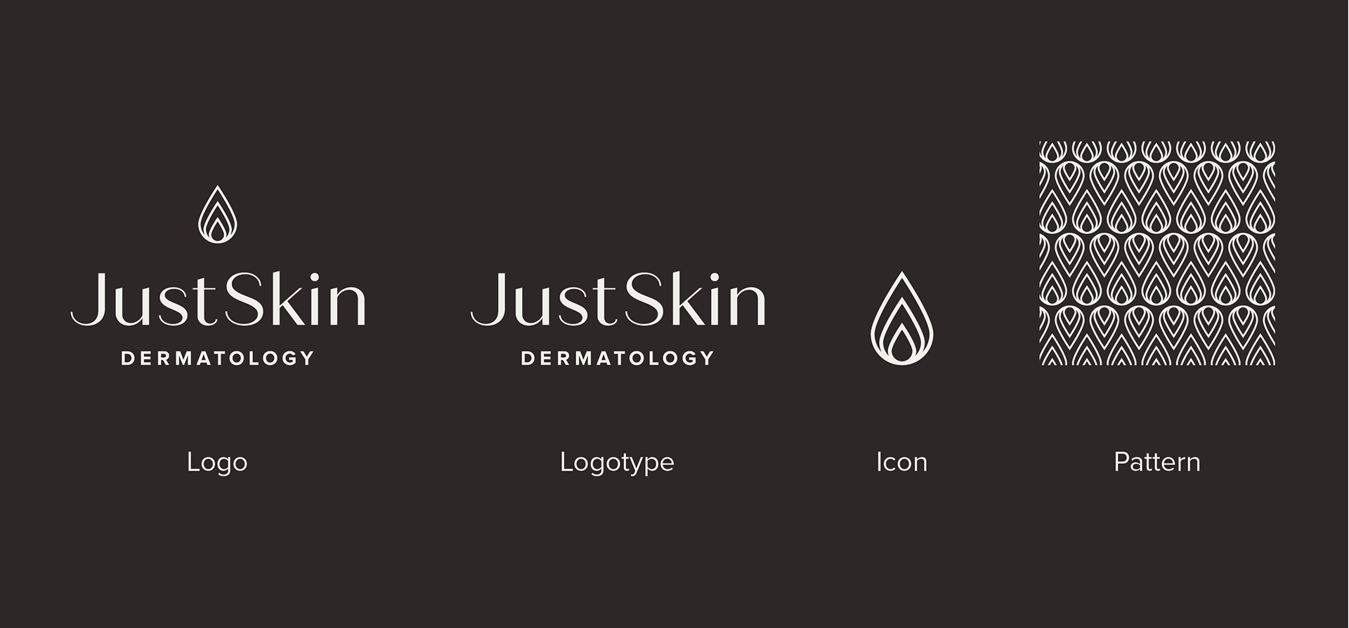
To reflect JustSkin's mission to enhance confidence and natural beauty, I drew inspiration from organic elements, including botanicals, minerals, and silk-like textures. I also considered the science of skin, focusing on its three main layers: epidermis, dermis, and hypodermis. Each "droplet" in the icon symbolizes one of these layers. For the main logotype, I chose a high-contrast typeface to give the logo a luxurious, approachable feel, avoiding a purely clinical appearance.
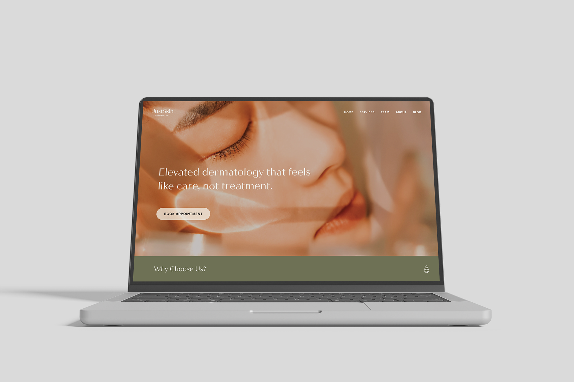
Concept for a website landing page
Outcome
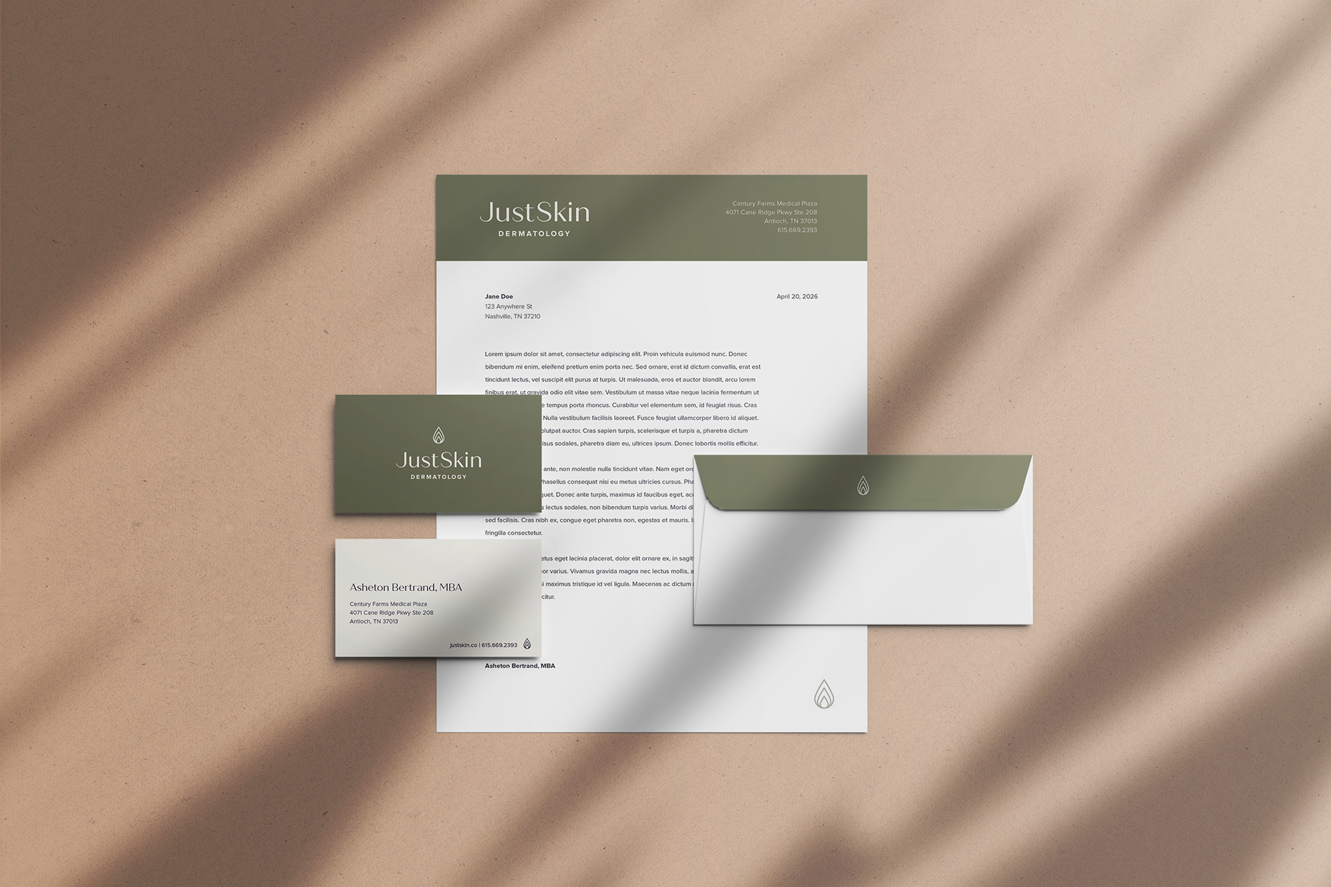
The visual brand system positions JustSkin squarely between aesthetic beauty brands and overly sterile medical groups. JustSkin is about stripping skincare down to its essentials while still delivering expert, elevated care.
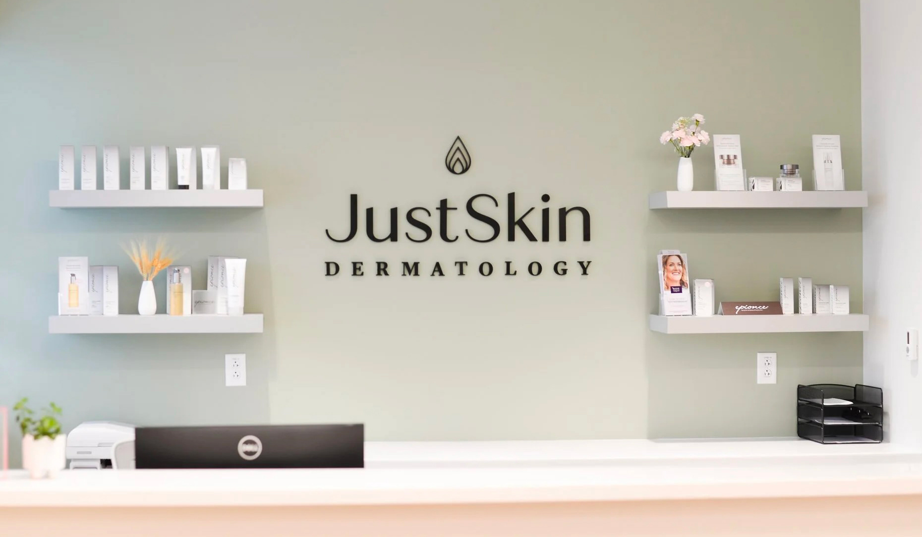
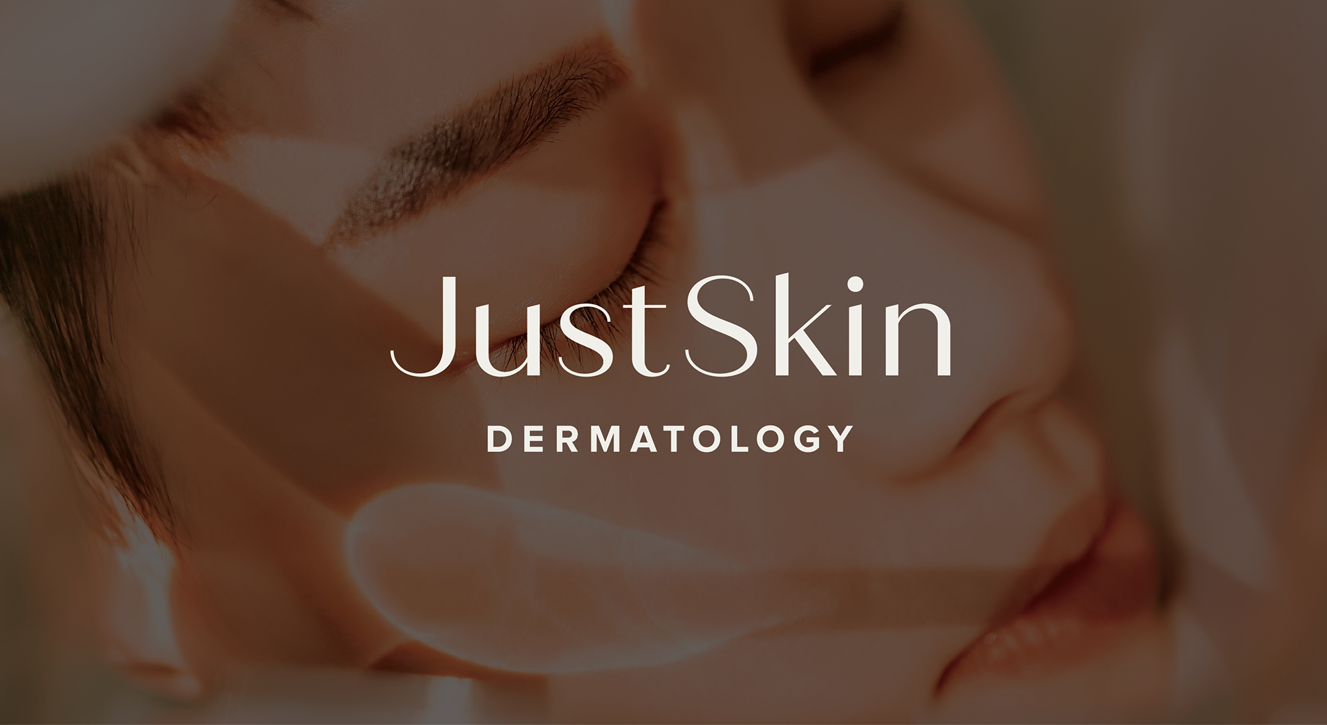
Office reception area (a serif typeface was used in an earlier iteration of the logo before it was finalized)